A modernized, more fluid brand mark
Creating differentiation while carrying some familiar elements forward
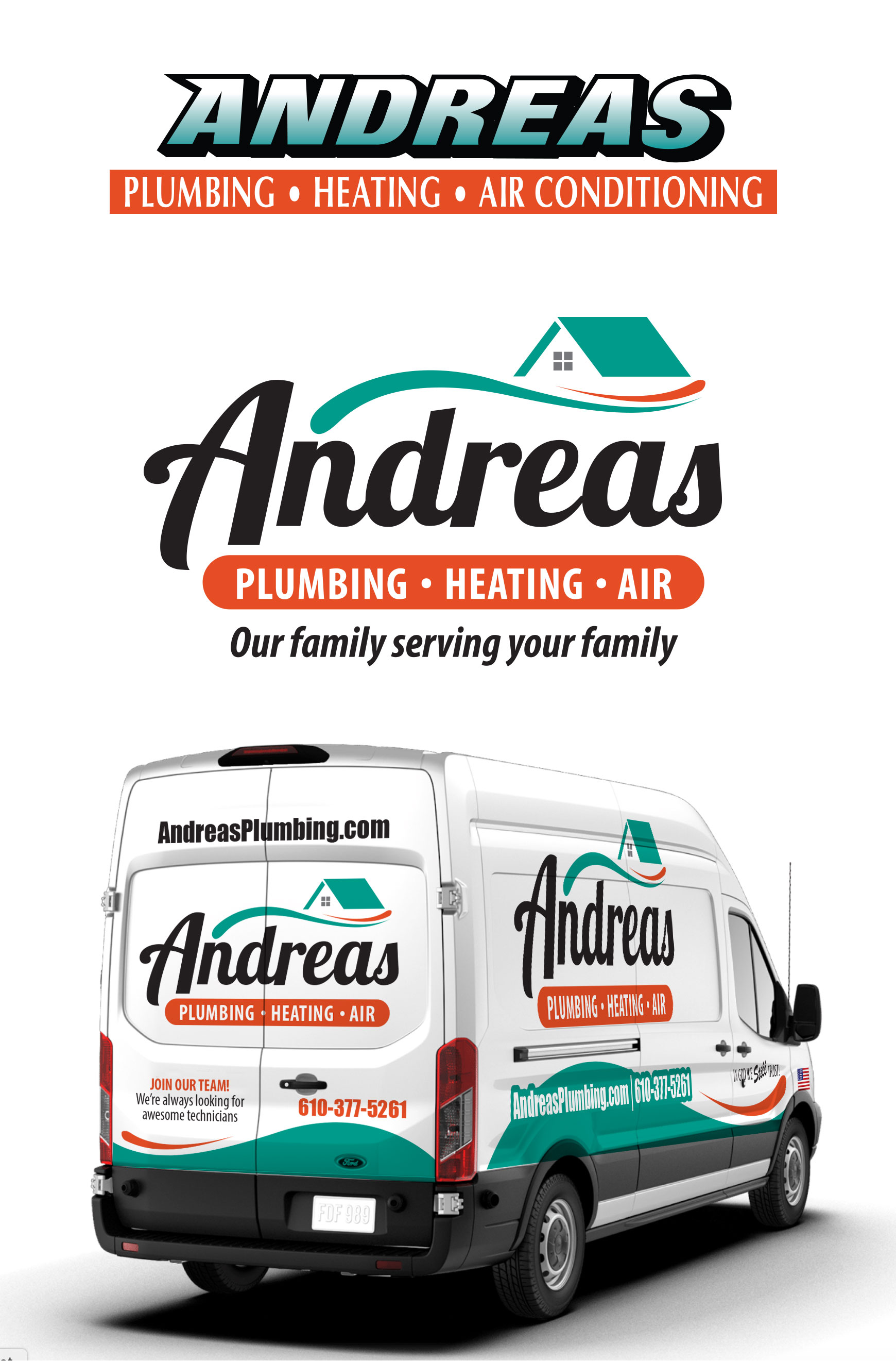
The top image is the old logo. The middle image is the new, refreshed logo. The bottom image shows the new logo implemented on the company’s service truck. Part of any branding project requires research. What do your competitors look like? What color scheme are they using? What is the tone and personality presented by companies in your market?
Competitive research discovered similarities and existing, unique elements
Three out of five competitors used a heavy black, zoom drop shadow as shown in the top image (old logo). This technique is dated and in this market it was also a “copy cat” visual element. We knew that look needed to go away. We discovered that the teal, orange and black was a unique color scheme in the market. We decided that was something we wanted to maintain. The client wanted us to explore some typical industry icons, water drops, flames and snow flakes to represent the services. That, was also a “copy cat” approach. We developed some concepts with these typical icons, but also developed the whole logo to be more fluid and rounded. This look suggests the movement of water and air and breaks out of the rigid, boxy look of the old logo. The house roof line brings it all home, so to speak; the company serves mostly residential clients.
Once the brand mark was complete, we were asked to implement it on truck graphics
The bottom graphic shows how we extended the new look to the Andreas trucks. We leveraged the dynamic shape movements to create graphics that get noticed while keeping the name of the company and services prominent.


